Making Private
Aviation More Accessible
🎵 If you are a synesthete like me, I would suggest reading this case while listening to the playlist bellow 🎵
Project Duration
2 years 7 months
Product Team
1 UI/UX Designer (Rafaela’s Role)
1 Project Manager
2 FE Developers
2 BE Developers
1 QA Tester
1 Scrum Master
Background
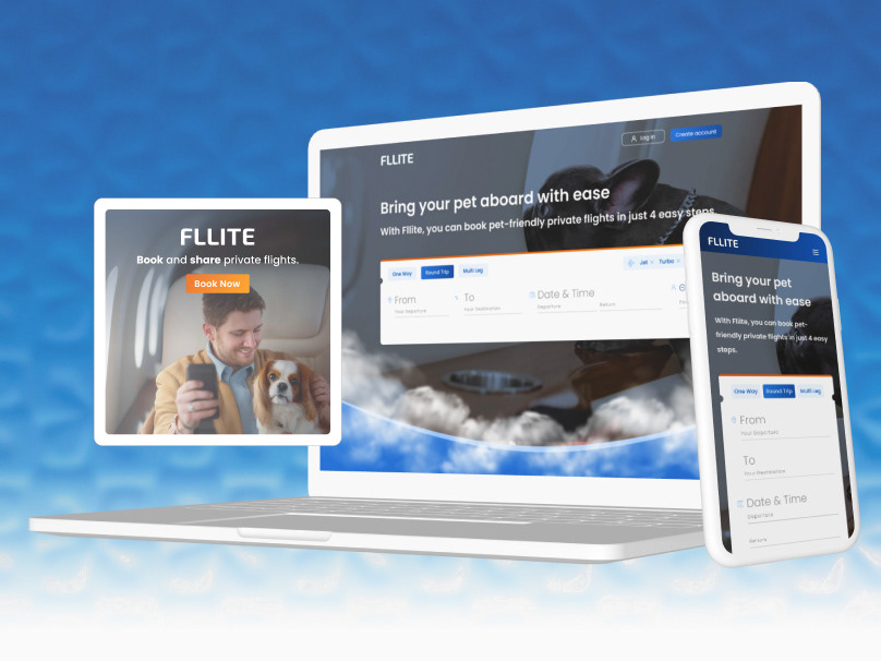
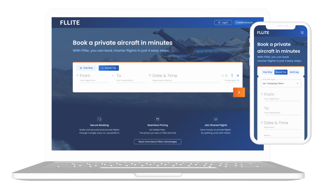
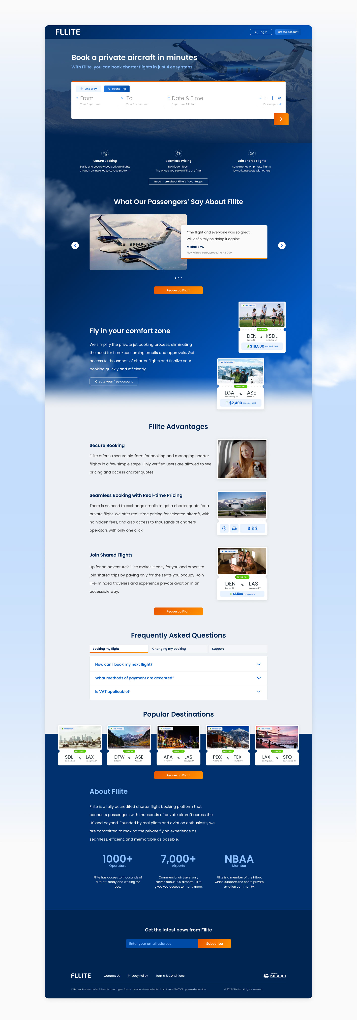
Fllite is a private aviation marketplace that connects charter operators to travelers who want to fly privately in the USA.
The company’s mission is to revolutionize the private aviation industry by automating processes, allowing travelers to instant book available aircraft within minutes, and allowing users to share seats in their booked flights, making flying privately more affordable to other audiences.


Challenges
- Align business requirements with user-friendly designs;
- Design for a complex product with three different applications with different targeted personas;
- Anticipate scenarios and prepare trade-offs to negotiate designs with different stakeholders;
- Create mobile designs and introduce a mobile-first approach with adaptive instead of responsive designs to the product.
- Simplify complicated flows by identifying and using affordances and design patterns found in products within the same space or products users use in their daily lives;
- Optimize key flows for user retention and business growth and run experiments to identify best practices for the targeted persona.
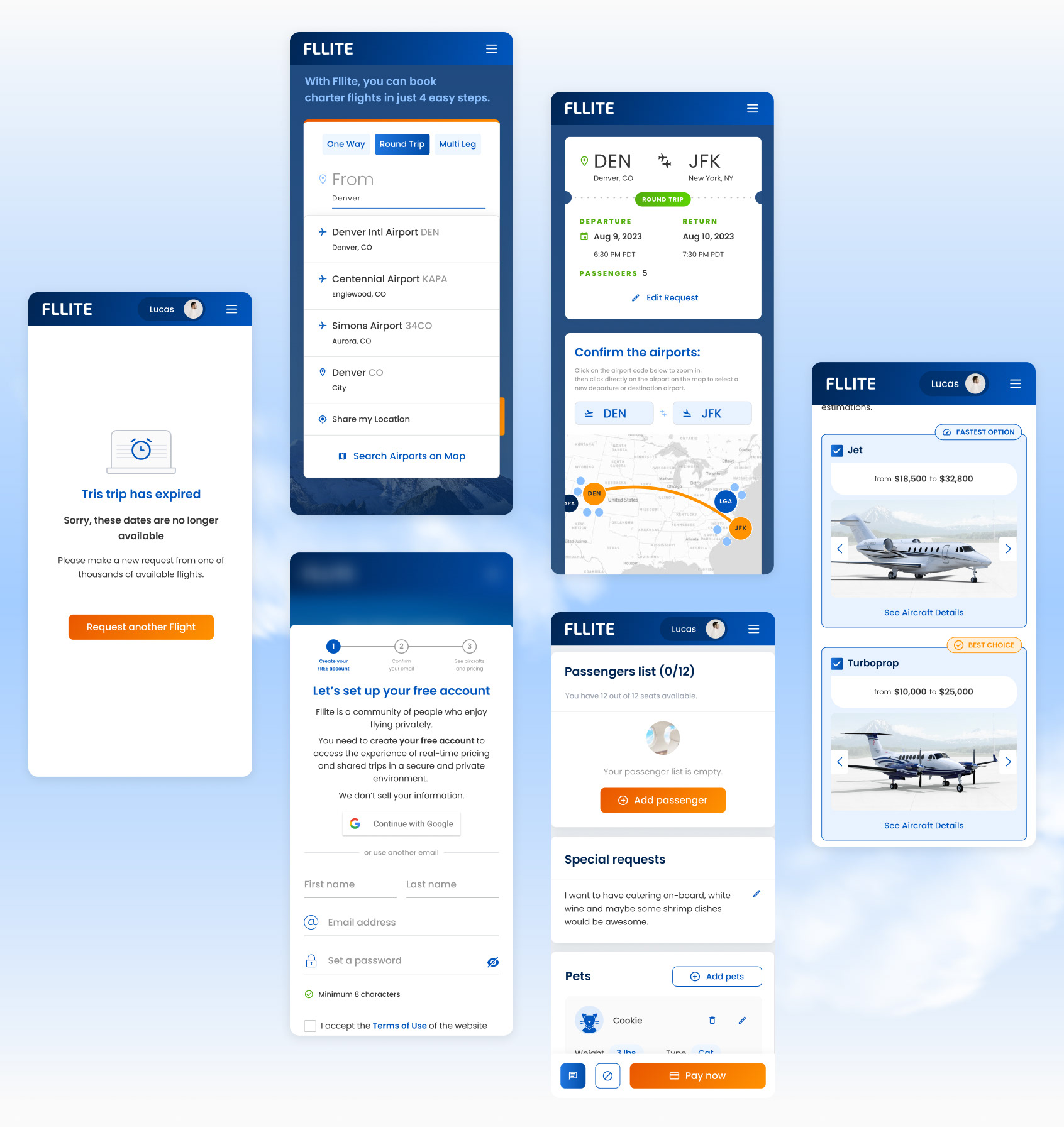
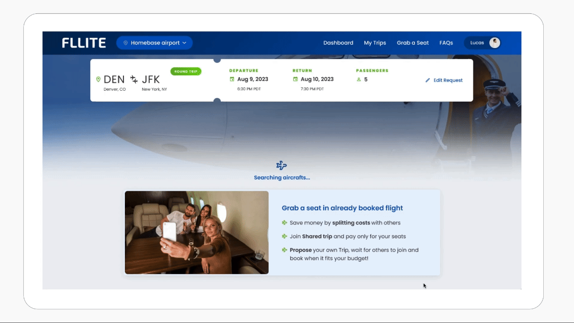
Prototype Snapshot: designed to show how the loader should behave after the request. UI, loader, and animation done by Rafaela.
The Design Process
I am adept at a lean design process approach to my projects, which follows the basic design process frame of:
Problem→ Research → Experiment → Deliver → Test
The Problem was provided by the client, the internal team, or by user testing.
The Research phase was based on competitor analysis, desk research, user data, and user testing.
The Experiment phase was iterating on possible solutions, and then presenting them to the internal team and to the client.
The Deliver phase is to handoff the design to developers in Figma or prototypes.
The Test phase consists of usability testing and analyzing user behavior to identify constraints or design possibilities.
Process Snapshot #1: The task given was to improve the UX by adding loaders in steps that could be beneficial to keep users engaged with the process of requesting a flight. I first took a look at references of how others are doing it then I went on analyzing the "Request a Flight" flow, starting by looking at users' session recordings and taking notes of frictions identified by lack of status information, or longer loading times.
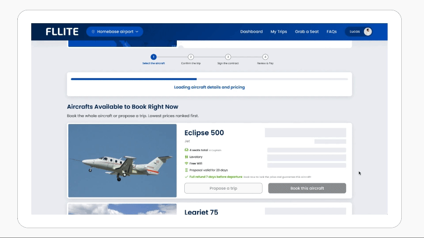
Process Snapshot #2: After discussing my observations with the team, we agreed on what could be done in a given timeframe, and then I went back to Figma to start iterating on solutions. When I was satisfied, I went back to the team, to collect feedback and decide on one direction to present to the client. After we agreed, I designed a high-fidelity prototype, to show and document how transitions, skeletons, and progress bars should behave as the cards load. The loaders were approved, the prototype was handed over to the developers, and implemented in the product.
What I delivered
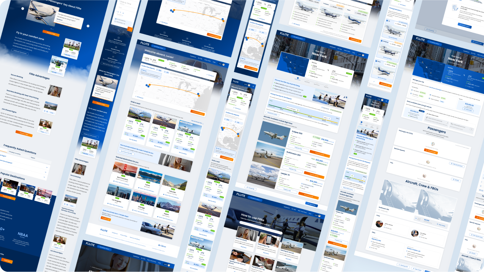
- Product Design: designed various interfaces, interactions, and the overall experience (including transaction emails, ads, and copy) to unify the design of the different parts of the product (Fllite Admin, Fllite Consumer, and Fllite OPS);
- Product Mapping: I created a detailed user flow document, to map all the different events from the user sign-up to the flight, to allow the product manager to have a better overview of the product;
- Mobile Optimization: to ensure the WebApp would provide a great experience for Fllite’s majority of users;
- UX Metrics: to measure the success of new features and how they impacted the business;
- User Testing: through unmoderated tests, focused on usability to uncover areas and features to improve;
- Designed and ran workshops: to ideate features, receive design critique, and share data and insights collected from user and desk research, with various stakeholders, including the client, developers, project managers, designers, and other members in U+;
- Design Audits: to ensure the quality of the implementation and to discover areas to improve through interaction design.


Outcomes
- 94% increase in confirmed users with a redesign;
- Unified a Design System and Visual Style for both customer-facing applications (B2B and B2C);
- Implemented a culture of user and data-centric product interventions;
- Added movement to the product by designing animated elements (loaders, skeletons), and transitions in closer cooperation with devs;
- Kept Figma Files organized and updated so stakeholders involved in the project had autonomy in finding the right interfaces and flows.